New KAEMI logo: what stays, what changes
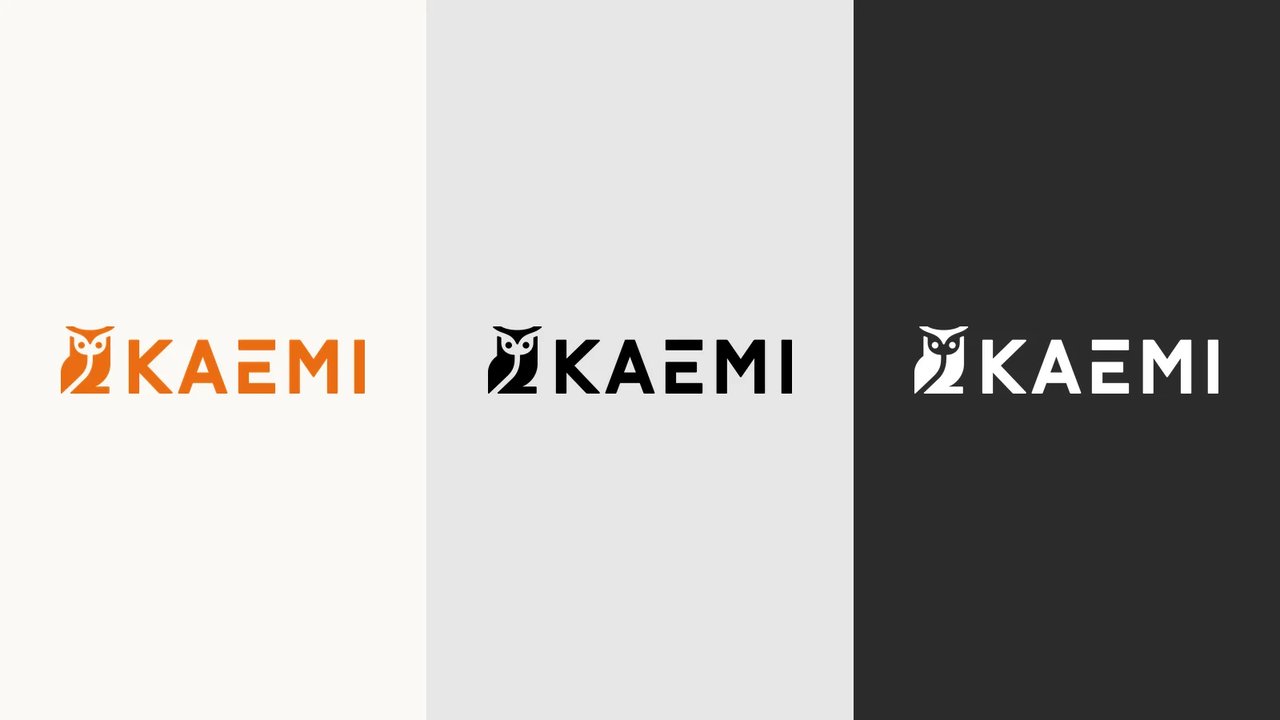
For ten years, our previous logo has been with us. For our team, our customers and our partners it became a familiar sign. So why change something so closely tied to KAEMI?
Today we are a managed security service provider (MSSP) with a clear focus. Secure networks, Zero Trust and microsegmentation shape our work, and we want people to see that.
“Since our founding in 2016, we have sharpened our focus. Today it is clearer what KAEMI stands for. Our brand should show that too.”
Sven Launspach, CEO of KAEMI
The owl stays
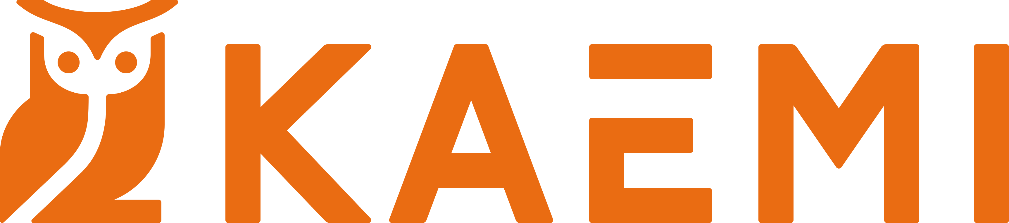
We started with a question: what defines our brand, and what do we need from it today? The owl belongs to KAEMI, so it stays. What changes is its form. The fine line drawing has become a solid figurative mark, and the lettering has gained weight as well.
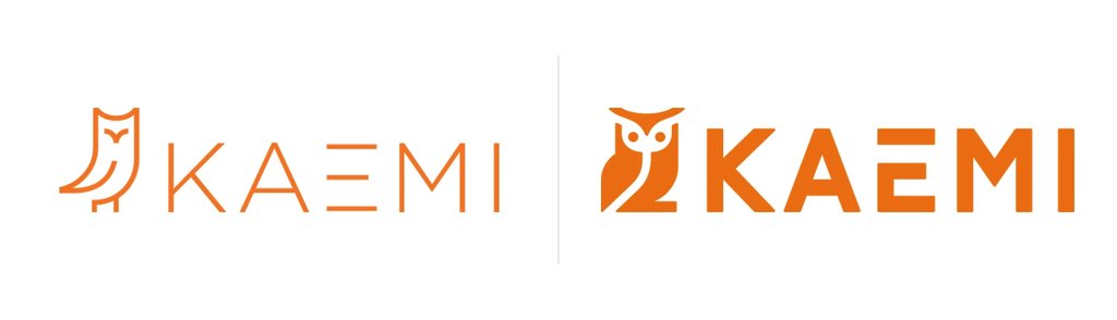
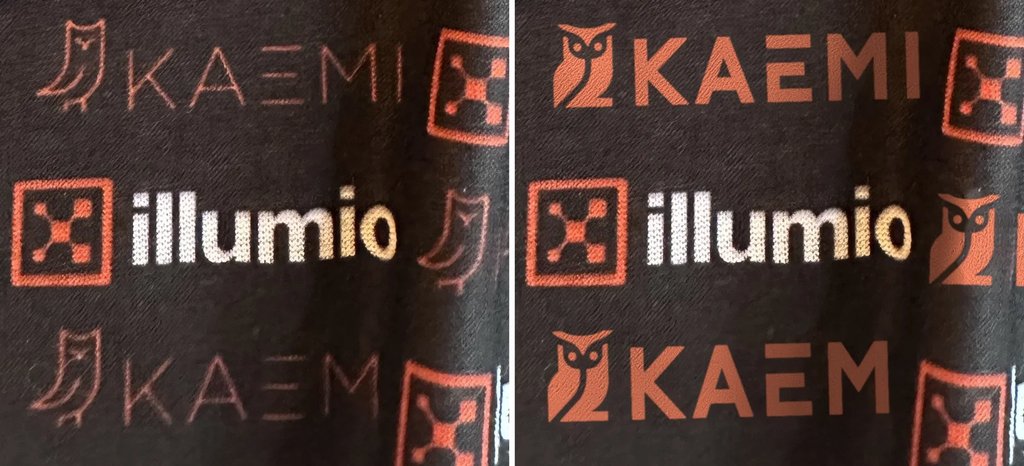
The reasons are practical. On trade fair walls, textiles and other materials, the previous logo lost presence because of its thin lines. The new shapes are bolder and easy to recognise from further away.
Our corporate design now also explicitly includes black and white versions of the logo. That gives a clear contrast on any background, whether on a dark partner wall, on photos or in one-colour print.
The change is visible online too: in our website header, in search results and in e-mail signatures.
Drawn by hand, with us from the start
The new logo was designed by Luis F. Masallera. Luis has known KAEMI since our early days. With him, we could talk openly about what we are attached to and what should change. That made the work on the new logo very personal for us.
We use AI where it genuinely helps. Our new logo, however, was made by hand, with Luis’s personal signature and his view of KAEMI that has grown over the years.
Ten years on
We associate the previous logo with building KAEMI and with many projects we did together. The new logo builds on that. The owl remains our sign, just bolder, and there is now a suitable variant for every background.
You will find all files for the new KAEMI logo, the colour variants and the rules for partners, agencies and press on our corporate design and logo kit page. Questions about the logo? Write to us at media@kaemi.io.